Mapping the Jews’ Temporary Shelter – A Retrospective
Jews’ Temporary Shelter Cards: An interview with Research Associate Lewis Smith
How did you get involved with the project and what were your expectations?
It was originally flagged to me by a colleague in the Department of History at the University of Essex. I had done a couple of mapping projects (mostly under my own steam as they weren’t the key output), but nobody had ever said to me ‘go for it, make us a map!’ – so this really was an obvious thing to go for! I don’t really think I had any expectations, all I knew was that I was excited to get started playing around with data.
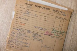
When you saw the JTS record cards for the first time, what were your initial thoughts and what ideas did you have for what could be done with the data?
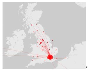
A map was the first priority, so in looking at the cards, the potential of a map was at the forefront of my mind. What would be good information on a map? Beyond that, I didn’t really have much in the way of initial thoughts on the data. It made sense first of all to visualise each section of the cards, and from there the ideas started rolling about how each category could be tied together to show different trends.
As you got stuck into the project was there anything unexpected that surprised you? (both in terms of the content and the work process)
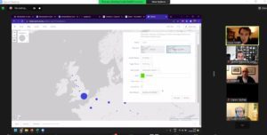
It’s a bit of a cop-out answer, but I’d like to say that everything surprised me – that was one of the best appeals of the project, that we didn’t really know much about the cards themselves. Therefore, everything felt like a surprise! Within this, I have to say that finding out things like the length of stay at the Shelter and the age ranges – things which mark the beginning of the change from a standard dataset to something human. I also think that one of the unexpected things was the learning curve of programming a map in HTML – I feel I may have underestimated that challenge, but like all programming it was rewarding to see it working!
How did you find the engagement aspects of this project, leading a talk and running two online geo-referencing workshops?
Nerve-racking, but highly rewarding! Particularly with the workshops, it was important to make sure things worked right live. As I’m sure almost all of the audience can attest, when was the last time something on a computer went right the first time? I teach lots, but this was probably the most I’d ever prepared for a workshop so that I could mitigate the computer deciding to teach its own workshop. It worked (mostly!) well with only a few styled-out errors! I’d also say I was nervous of feedback – the engagement events were the only immediate opportunities to ‘show off’ what I had done to a public audience, so I wanted to make sure I was impressing them!
Did your view of the project change at all as the project developed?
After years of work on very broad historical questions, part of the fun of this project was to just see this as ‘data’, as a big spreadsheet that needed visualising – but actually, as the project went on, it became clearer and clearer that this wasn’t possible, and actually there were some very serious broader historical questions that needed addressing. On the plus side, the original plan of the project (start with data, then talk about what the data meant) helped this evolve naturally, but I think those broader questions should have been more central, earlier.
If you could do it again, is there anything you would have changed?
Loads! As with any project work, as soon as it’s over, you think about everything you could have done differently. My main thing would probably have been attempting to do something with the ‘Remarks’ section of the cards as these told more of a story (though this would have taken time away from the map). Of course, there are also loads more things I wish I could have done to the map itself – more lines to show movement of people before and after, more features for users, clustering – but often simplicity is what works best.
What will be your most memorable aspect of the project?
The workshops were fantastic – it was great to get the opportunity to show off the fact that anyone can do complex digital things with a little boost. Digital tools and visualisations are open for anyone who is prepared to put in a bit of time, not just programmers and software developers! It gave me a chance to put the digital record straight!
Is there anything else you would like to add?
The last three months have felt more like three minutes. This really was a unique opportunity and, whilst there were elements that were challenging, I have enjoyed learning new things – about people and communities across Europe, and about engaging people with history.
Visit the project pages here: Mapping Migration: The Jews’ Temporary Shelter following WWII
Read Lewis’s blogs about the project: Jews’ Temporary Shelter Cards: A Snapshot & Jews’ Temporary Shelter Cards: Charting Patterns of Migration
The JTS Cards Project, Mapping Migration, is supported by The Audience Agency’s Digitally Democratising Archives project thanks to funding from DCMS and the National Lottery, as part of The National Lottery Heritage Fund’s, Digital Skills for Heritage initiative.


![]()